A barcode that will not scan is worse than no barcode at all: it stalls a checkout line, gets your product rejected by a retailer’s receiving team, and can force a relabel of the whole run. On a custom label, the barcode is the one element with hard, published tolerances, and shrinking it to fit a small bottle or squeezing it into a corner is where most avoidable failures come from. Here is how big a retail UPC actually needs to be, and the two details that quietly decide whether it reads.
The nominal size and the range around it
The retail barcode most products carry is a UPC-A, and it has a defined nominal size at what the standard calls 100% magnification: about 37.3 mm wide and 25.9 mm tall, or roughly 1.47 by 1.02 inches, including the mandatory clear space on each side. From there the symbol can be scaled within an allowed magnification range of 80% to 200%. Everything scales together and in proportion, so bars, spaces, height, and clear space all grow or shrink by the same factor, which is why you cannot simply squash a barcode’s height to make it fit a thin label.
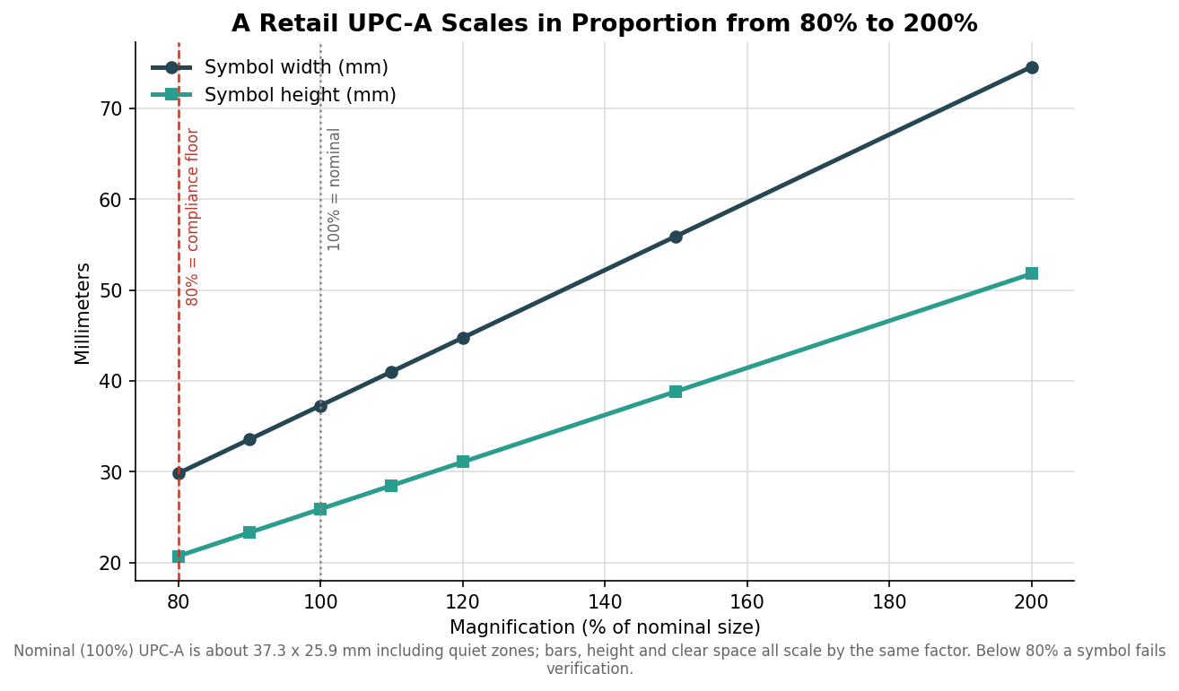
At the small end, 80% is the compliance floor: a symbol printed smaller than that will fail a barcode verification report and is likely to be rejected by retailers who check. At 80% the symbol is roughly 29.8 mm wide. Most guidance recommends staying at 100% to 120% for anything sold through a general retail lane, because that is where point-of-sale scanners read fast and on the first pass, and the few extra millimeters buy you real reliability. Go bigger only when you have room; go smaller only when you have measured that it still scans.
The two details that actually break scanning
Two features fail before the overall size looks obviously wrong, and both shrink when you scale the barcode down. The first is the X-dimension, the width of the narrowest bar or space, the module the whole code is built from. At 100% it is about 0.33 mm, and as magnification drops it drops with it. Once the X-dimension falls below what your printer can render cleanly, the bars blur into each other and the scan fails regardless of how the code looks to the eye.
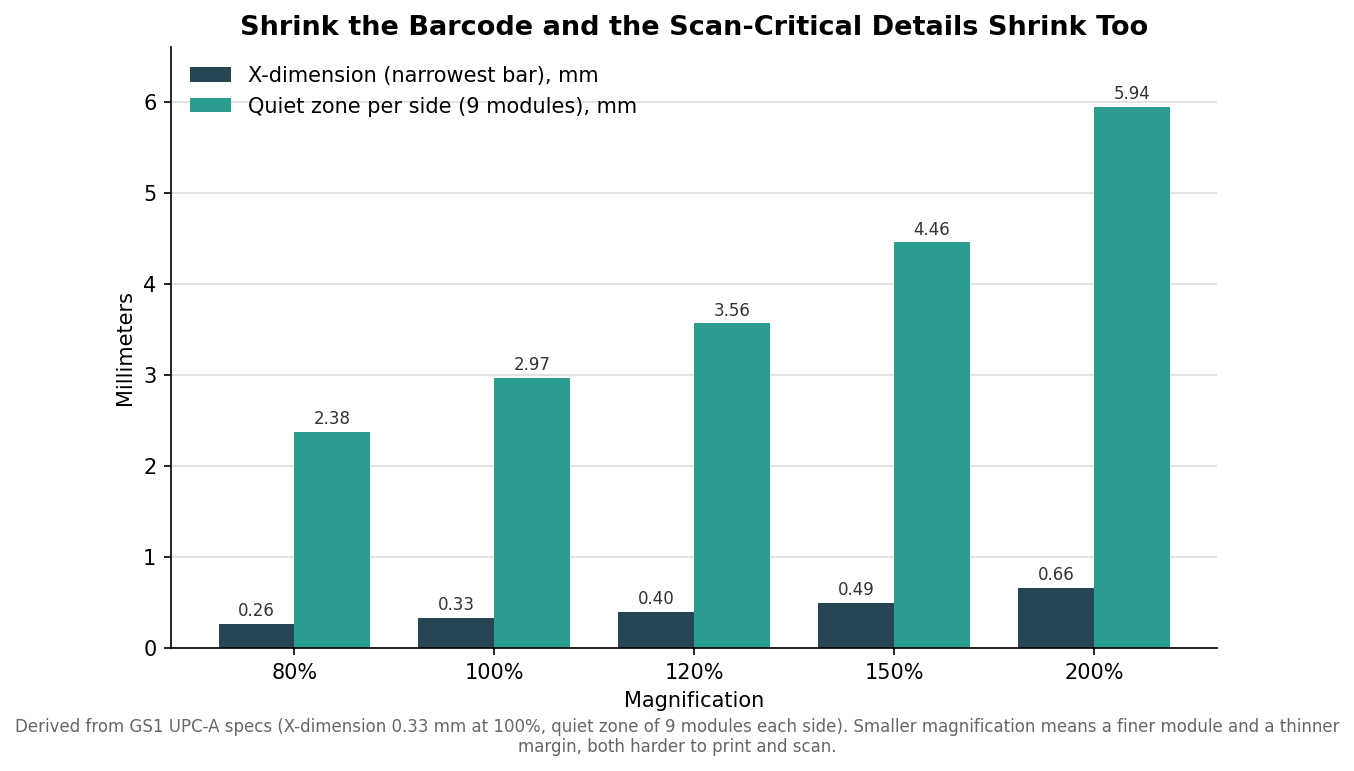
The second is the quiet zone, the blank margin on each side of the bars. UPC-A requires at least nine modules of clear space on each side, which at 100% is roughly 3 mm, and it must stay empty, with no text, border, or artwork intruding. Designers lose more scans to a violated quiet zone than to almost anything else, because a tidy-looking layout that tucks the barcode against a fold, an edge, or a line of copy silently eats the margin the scanner needs. When you scale the barcode down, that margin shrinks too, so a small symbol is doubly unforgiving of a crowded layout.
One more habit prevents reprints: keep the human-readable digits beneath the bars, and never let a design crop or delete them. Those numerals are the fallback a cashier keys in when a code will not scan, and a retailer can reject a symbol that has them trimmed off. If your products also sell outside North America, the equivalent international symbol is the EAN-13, the same barcode family at nearly the same nominal size and the same 80% to 200% range, so the sizing logic here carries over with only small differences in the clear-space rule.
Print and material matter as much as size
Size is necessary but not sufficient. Bars must be dark on a light background with strong contrast; a true black or dark blue on white or a light stock is safest, while red or warm-toned bars can read as blank to a red-laser scanner and should be avoided for the bars themselves. Print resolution matters at small sizes, since a 300 dpi press holds a crisp small barcode far better than a 203 dpi one, so if you are pushing toward the 80% end the equipment and the substrate both have to be up to it. Glossy and clear label films can throw glare that confuses a scanner, and busy or textured backgrounds cut contrast, so keep the barcode on a clean, matte, high-contrast patch even when the rest of the label is glossy or transparent.
How to spec it so it scans the first time
Decide the barcode size before you finalize the label layout, not after, because it sets a minimum footprint the rest of the design has to accommodate. Reserve a clean rectangle sized for at least 100% magnification with its full quiet zones intact, keep it on a light, matte area, and orient it so the bars run in the direction your labels unwind if you are printing on a roll. Ask your printer to run a barcode verification on the proof, not just a quick phone-app scan, because verification grades the code against the standard and catches the marginal X-dimension and contrast problems a lucky scan hides. If space is genuinely tight, talk to your printer about a smaller-footprint symbology or a rearranged layout rather than pushing the UPC below 80%.
The goal is a code that reads on the first pass at every checkout, and that outcome is decided on the artwork, long before the labels are on the shelf. Get the size, the quiet zone, and the contrast right up front, verify the proof, and the barcode becomes the one part of the label you never have to think about again.
Leave a Reply