Author: George

  • Cosmetic Label Requirements: What FDA Rules and MoCRA Put on Your Label

    Cosmetic Label Requirements: What FDA Rules and MoCRA Put on Your Label

    A beautiful label that skips a required element is still a non-compliant label, and for cosmetics the requirements are specific enough that brands trip over them all the time. Before you approve artwork for a skincare or beauty product sold in the United States, it helps to know exactly what has to appear, where it goes, and how small the type is allowed to be. This is a plain-English walkthrough of what federal rules ask for, plus what the Modernization of Cosmetics Regulation Act, known as MoCRA, has added.

    The two panels every cosmetic label is built around

    Federal labeling divides your container into two working areas. The principal display panel is the face a shopper sees first on the shelf. It has to carry a statement of identity, meaning the product name together with a description or illustration of what the product is, so a jar reads clearly as, say, a facial moisturizer rather than just a brand word. The principal display panel also carries the net quantity of contents. Everything else, including the ingredient list and the company’s contact details, can live on the information panel, which is any panel immediately to the right of the principal display panel or another surface designed for that copy. Getting this split right early prevents the common mistake of crowding required legal copy onto the front where it fights your branding.

    Net quantity, identity, and the business address

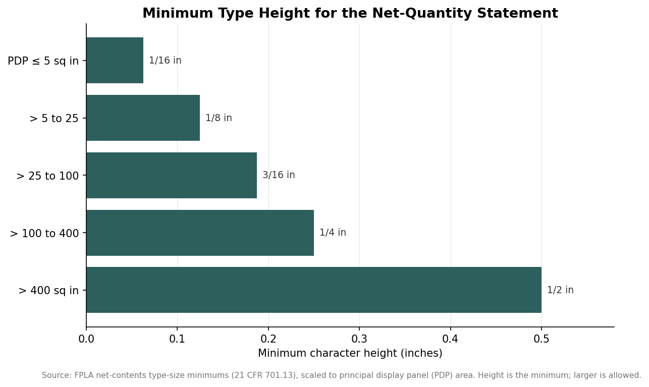
    The net quantity statement has real formatting rules. It belongs in the bottom area of the panel, set on a line generally parallel to the base the package rests on, and its type has to be sized to the panel. For solids and semisolids you use avoirdupois pounds and ounces; for liquids you use fluid ounces, pints, quarts, or gallons; and once a package holds at least a pound or a pint you express the larger measure in parentheses, as in sixteen ounces followed by one pound in parentheses. You may add metric units alongside. The minimum character height scales with the size of the principal display panel, which the chart below lays out.

    Horizontal bar chart of minimum net-quantity statement type height by principal display panel area, from 1/16 inch to 1/2 inch
    Minimum type height for the net-quantity statement scales with panel size.

    On the information panel you need the name and place of business of the firm marketing the product, including a street address, city, state, and ZIP code. The street address can be dropped only if the firm is listed in a current phone or business directory. If the company selling the product did not make it, which is true for most small brands using a contract manufacturer, the address has to be qualified with a phrase like “Manufactured for” or “Distributed by.” Products of foreign origin also need a country-of-origin statement.

    The ingredient list: order, INCI, and fragrance

    Ingredients are declared in descending order of predominance, so the component you use most is listed first and the trace ingredients come last. There is a practical exception: color additives and any ingredients present at one percent or less do not have to follow strict order, which is why you often see colors grouped at the end. Names must follow the recognized nomenclature, in practice the INCI system, so “water” appears as aqua and botanical extracts appear under their standardized Latin-plus-common naming. Fragrance and flavor can be declared simply as fragrance or flavor rather than broken into constituents, and genuinely proprietary components can be grouped as “and other ingredients” after the disclosed ones. Type size matters here too: the ingredient declaration must be at least one-sixteenth of an inch tall, dropping to one thirty-second of an inch only on very small packages whose total surface is under twelve square inches.

    When your “cosmetic” is actually a drug

    This is the distinction that catches skincare brands most often. The moment a product makes a therapeutic claim or contains an active that changes the body’s structure or function, it is regulated as an over-the-counter drug in addition to being a cosmetic. Sunscreen, anti-acne treatments, antiperspirants, anti-dandruff shampoo, and anything promising to treat a condition all fall here. Those products need a Drug Facts panel and must list active ingredients first, ahead of the cosmetic ingredients, along with the drug’s uses, warnings, and directions. If your moisturizer advertises an SPF, you are labeling a drug, not just a cosmetic, and the artwork requirements expand accordingly. When a product’s safety has not been substantiated, federal rules even prescribe a specific warning that the safety of the product has not been determined.

    What MoCRA added, and what is still coming

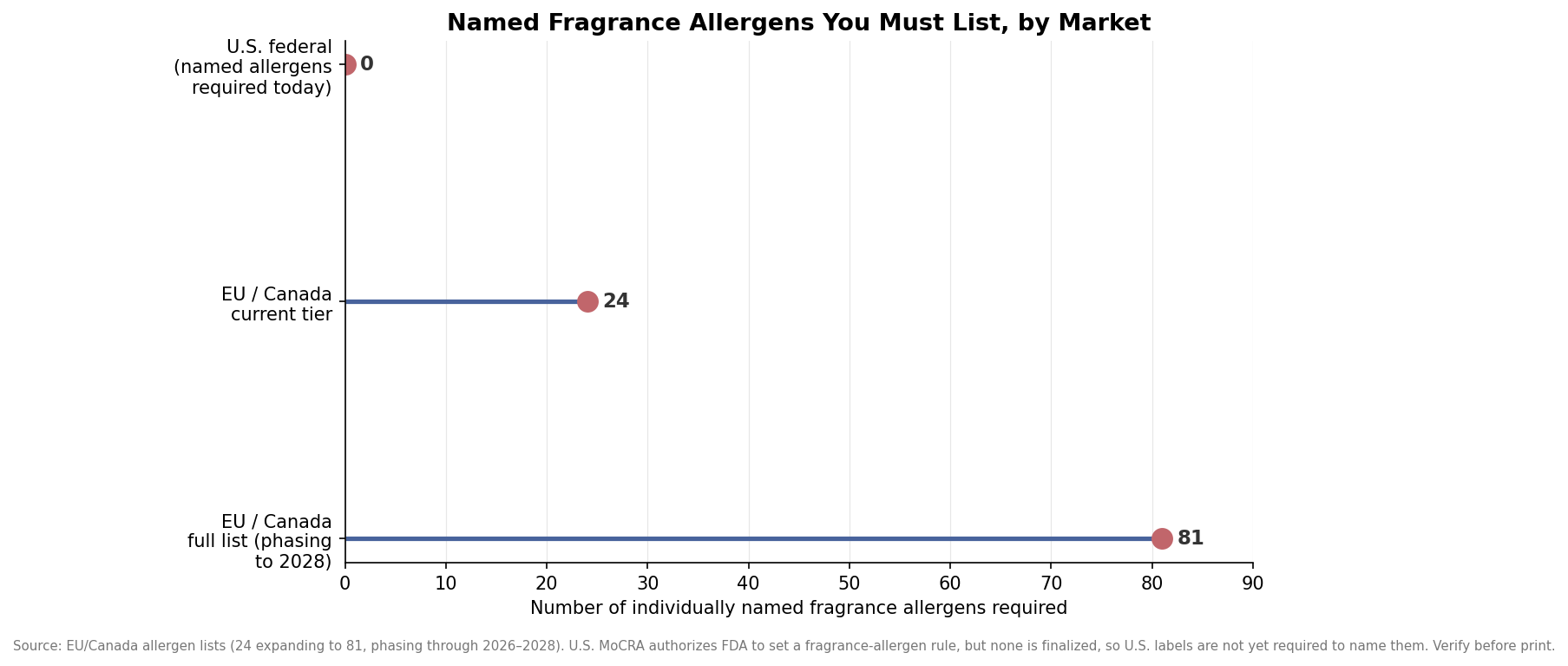
    MoCRA layered new obligations on top of the long-standing rules. The label-facing one to plan for is a requirement to provide contact information through which the responsible person can receive adverse event reports, which in practice means a domestic address, a domestic phone number, or an electronic contact tied to the party accountable for the product. Products meant only for licensed professionals should also carry a clear professional-use statement while still meeting all the consumer requirements above. The change many brands ask about, individually naming fragrance allergens on the label, is authorized under MoCRA but has not yet been finalized as a binding federal rule, so United States labels are not currently required to list them. That is very different from the European Union and Canada, which already require named allergen disclosure and are expanding those lists, as the second chart shows. If you sell internationally, design your ingredient copy with that trajectory in mind rather than reprinting later.

    Lollipop chart comparing named fragrance allergen disclosure counts: 0 required in the US federally, 24 and 81 in EU and Canada
    Named fragrance-allergen disclosure required by market; the US rule is not yet finalized.

    Two takeaways make the whole thing manageable. First, lay out the required elements before the visual design, not after, so legal copy has a home and a legible type size instead of being squeezed in at the proof stage. Second, decide honestly whether your claims push the product into drug territory, because that single question changes the entire panel structure. This overview covers the common cases, but requirements change and edge cases exist, so confirm the current FDA guidance or run your final artwork past a regulatory specialist before you commit a print run.

  • Custom Labels: Prices, MOQs, and Lead Times Before You Order

    If you’ve never ordered custom labels before, the range of quoted prices online looks almost random — $2 a label at one shop, $0.10 at another, a “$29 for 50” deal banner on a third. It isn’t random. It’s driven by three variables: how many you order, what they’re printed on, and how fast you need them. Once you know where the real price breaks sit, picking a vendor and a spec sheet takes ten minutes instead of an afternoon of tab-switching.

    This guide walks through what custom labels actually cost at different quantities, the minimum order quantities you’ll run into depending on format, and how much faster — or slower — production runs depending on whether your order goes through digital or offset printing. Every figure below is tied to the source that published it; if a claim didn’t have a real number behind it, it didn’t make the cut.

    Bring a rough sense of your quantity and material needs and you’ll be able to read a quote from any label printer and know immediately whether it’s competitive.

    $0.70–$1.10
    per label, 100-unit die-cut vinyl order
    50 / 25
    typical MOQ, roll labels / die-cut labels
    2–3 days
    standard digital production turnaround
    10–15 days
    standard offset turnaround from proof approval

    Source: Stickerine.com 2026 pricing guide; Cubit Packaging 2026 rush-order guide

    What custom labels actually cost

    Price per label drops fast as quantity climbs, which is why a quote for 25 labels and a quote for 500 labels from the same printer can look like they’re for different products. At the very low end — under 25 labels — expect to pay $2 to $4 per label, since you’re absorbing most of the fixed cost of running a press for a tiny job. Step up to a 100-count order of standard 3-inch die-cut vinyl labels with a laminate finish and the total typically falls in the $70–$110 range, which works out to roughly $0.70–$1.10 per label.

    Keep climbing and the per-unit price keeps falling. Vinyl and BOPP film labels generally settle into a $0.10–$0.30 per-label range once you’re ordering in the low hundreds, and further volume — several thousand units — can cut that by another 40–60%. This is the main reason label printers push you toward round-number quantity tiers (100, 250, 500, 1,000): each tier crosses a real cost threshold on their end, not just a marketing one.

    One cost most buyers don’t budget for: setup or plate fees. Digital printing, which is how most small and mid-size custom label orders are produced now, typically carries no setup fee at all. Setup fees in the $25–$50 range mostly show up with offset or screen-printed labels, and only make financial sense once your order size is large enough to amortize them.

    Minimum order quantities by label format

    The format you choose — labels on a roll for dispensing, versus die-cut labels or full sticker sheets — changes your minimum order, not just your price. If you’re labeling bottles, jars, or anything that goes through an automatic or hand-crank label applicator, you’re ordering roll labels, and that format tends to carry a higher floor. If you’re hand-applying individual labels to boxes or product packaging, die-cut or sheet formats let you order fewer to start.

    Roll labels carry a higher minimum order than die-cut or sheet labels — plan your first order around the format you actually need, not just the lowest MOQ.
    Label format Typical minimum order quantity
    Custom roll labels / sticker rolls 50 units
    Custom die-cut labels / sticker sheets 25 units
    Roll labels carry a higher minimum order than die-cut or sheet labels — plan your first order around the format you actually need, not just the lowest MOQ.Source: Stickerine.com, "How Much Do Custom Stickers Cost? Real 2026 Pricing," 2026

    Lead times: digital vs. offset printing

    Almost every custom label order today runs through one of two production methods, and the gap between them is bigger than most buyers expect going in. Digital printing uses no plates and no die setup for standard shapes, which is why it can turn around a full custom label order in a matter of days. Offset printing produces a better per-unit price at very high volumes, but it requires plates to be made before a single label prints, and that setup time dominates the schedule.

    If a launch date or a retail deadline is driving your order, ask your printer which process they’re quoting before you commit — a vendor quoting offset pricing on a mid-size order may be handing you a two-week wait you didn’t budget for.

    Digital printing turns a standard custom label order around in days; offset printing takes roughly a week and a half unless you pay extra to expedite it.
    Printing method Standard turnaround Expedited turnaround
    Digital printing 2–3 business days Rush service available; premiums run 15–60% above standard, averaging ~28%
    Offset printing 10–15 business days from proof approval 5–7 business days
    Digital printing turns a standard custom label order around in days; offset printing takes roughly a week and a half unless you pay extra to expedite it.Source: Cubit Packaging, "Rush Order Labels, Stickers & Packaging Accessories (2026)"

    Choosing a material: BOPP, paper, and laminate

    Material choice is where a lot of first-time buyers underspec their order. BOPP — biaxially-oriented polypropylene — is a thin, durable plastic film that’s become the default for product labels because it holds up to moisture, oil, and general handling without extra coating. It’s the material used across food, cosmetics, and medical packaging precisely because those products get wet, get touched with oily hands, or sit in a fridge condensing water onto the label.

    Paper labels cost less per unit but aren’t weatherproof on their own — if the product they’re on will ever get wet, get refrigerated, or sit outside, plan on a laminate layer, which adds durability against scratching, heat, water, and sun exposure but also adds cost. If your product never leaves a dry shelf — think retail packaging insert labels or indoor promotional stickers — uncoated paper is the cheaper, perfectly adequate choice.

    When to pay for laminate

    Add laminate any time the label will be handled repeatedly, exposed to liquid, or stored somewhere temperature or humidity swings — drink bottles, bath and body products, outdoor gear, anything shipped in a cooler. Skip it for one-time-use labels, indoor retail signage, or anything that’s discarded shortly after the product is opened.

    Clear vs. white BOPP

    Clear BOPP gives a “no-label look” against colored packaging or glass, letting the container’s color show through between printed elements. White BOPP is the safer default when your artwork includes light colors or white space that needs to read as opaque rather than transparent.

    Ordering custom labels: what to confirm before you submit artwork

    Before you send a print file, confirm four things with the vendor: the exact quantity break you’re ordering at (since crossing from 99 to 100 units can meaningfully change your per-label price), whether the quote is digital or offset production, whether lamination is included or priced separately, and the actual ship date — not just the production time, since “2–3 business days” almost always describes time in the print queue, not transit.

    Round up your quantity slightly if you’re near a price-break threshold. Ordering 110 labels at the 100-unit rate often costs less than ordering exactly 100 at a lower-volume rate, because of how quantity tiers are structured. And if your artwork isn’t finalized, ask about proof turnaround separately — a free digital proof typically adds a day, but it’s the cheapest insurance against a full reprint.

    Frequently asked questions

    What's the cheapest way to order custom labels?

    Order digital-printed BOPP or vinyl labels at a round quantity tier (100, 250, or 500) rather than an odd number just below one, and skip lamination unless the product will get wet or handled repeatedly. Digital printing also avoids the $25–$50 setup fees that offset and screen-print shops charge, which only pay off at high volumes anyway.

    How many custom labels do I have to order minimum?

    It depends on the format. Roll labels and sticker rolls — the kind used with label dispensers on bottles and jars — commonly start at a 50-unit minimum. Die-cut labels and sticker sheets typically start lower, around 25 units, making them the better entry point if you’re testing a product before committing to a bigger run.

    How much faster is rush production and what does it cost?

    Rush service on custom labels typically adds 15% to 60% to the standard price, averaging around 28% across order types, in exchange for cutting days off the schedule. Digital printing is the format that rushes best since there’s no plate-making step to compress; offset orders have less room to speed up because the plate setup itself takes time regardless of how badly you need the labels.

    Should I choose BOPP film or paper for my labels?

    Choose BOPP if the label will contact moisture, oil, or condensation — drink bottles, skincare, food packaging, coolers. It’s a durable polypropylene film built for exactly that. Choose paper if the product stays dry and indoors; it’s the lower-cost option and, with a laminate added if needed, still holds up fine for retail and promotional use.

    Why did my per-label price change so much between quantities?

    Label pricing is front-loaded with fixed costs — press setup, proofing, in some cases plates — that get spread across however many labels are in the run. A 10-label order carries almost the same fixed cost as a 100-label order, so the per-unit price at 10 can run 5 to 8 times higher than at 500. This is also why bulk discounts round out sharply at 250 and 500 units, and drop again at 5,000-plus.

    The bottom line

    The custom labels market rewards buyers who order at the right quantity tier and pick the right material for how the product will actually be used — not the cheapest option on the page. If your product touches moisture or gets handled often, BOPP with a laminate is worth the extra cost; if it sits dry on a shelf, paper is money saved for nothing lost. And if a deadline is driving the order, ask upfront whether you’re quoted digital or offset production, since that single choice is the difference between a label in your hands next week or in three.

    Start with a realistic quantity, confirm the production method, and you’ll have a quote you can compare against anyone else’s in the market — apples to apples, not marketing copy to marketing copy.

  • How Big Does a Barcode Need to Be on Your Label? UPC Sizing That Scans

    How Big Does a Barcode Need to Be on Your Label? UPC Sizing That Scans

    A barcode that will not scan is worse than no barcode at all: it stalls a checkout line, gets your product rejected by a retailer’s receiving team, and can force a relabel of the whole run. On a custom label, the barcode is the one element with hard, published tolerances, and shrinking it to fit a small bottle or squeezing it into a corner is where most avoidable failures come from. Here is how big a retail UPC actually needs to be, and the two details that quietly decide whether it reads.

    The nominal size and the range around it

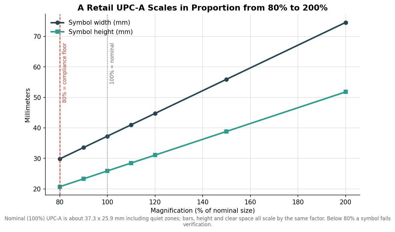
    The retail barcode most products carry is a UPC-A, and it has a defined nominal size at what the standard calls 100% magnification: about 37.3 mm wide and 25.9 mm tall, or roughly 1.47 by 1.02 inches, including the mandatory clear space on each side. From there the symbol can be scaled within an allowed magnification range of 80% to 200%. Everything scales together and in proportion, so bars, spaces, height, and clear space all grow or shrink by the same factor, which is why you cannot simply squash a barcode’s height to make it fit a thin label.

    Line chart of UPC-A barcode width and height in millimeters across magnifications from 80 to 200 percent
    A UPC-A scales in proportion from the 80% compliance floor through its 100% nominal size and up to 200%.

    At the small end, 80% is the compliance floor: a symbol printed smaller than that will fail a barcode verification report and is likely to be rejected by retailers who check. At 80% the symbol is roughly 29.8 mm wide. Most guidance recommends staying at 100% to 120% for anything sold through a general retail lane, because that is where point-of-sale scanners read fast and on the first pass, and the few extra millimeters buy you real reliability. Go bigger only when you have room; go smaller only when you have measured that it still scans.

    The two details that actually break scanning

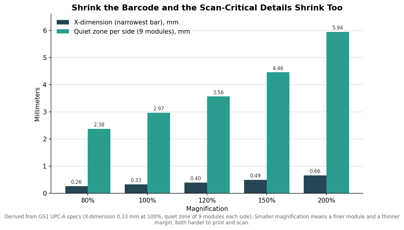
    Two features fail before the overall size looks obviously wrong, and both shrink when you scale the barcode down. The first is the X-dimension, the width of the narrowest bar or space, the module the whole code is built from. At 100% it is about 0.33 mm, and as magnification drops it drops with it. Once the X-dimension falls below what your printer can render cleanly, the bars blur into each other and the scan fails regardless of how the code looks to the eye.

    Grouped bar chart of UPC-A X-dimension and per-side quiet zone in millimeters by magnification
    The X-dimension and quiet zone shrink with the barcode, and both are what actually make a scan succeed or fail.

    The second is the quiet zone, the blank margin on each side of the bars. UPC-A requires at least nine modules of clear space on each side, which at 100% is roughly 3 mm, and it must stay empty, with no text, border, or artwork intruding. Designers lose more scans to a violated quiet zone than to almost anything else, because a tidy-looking layout that tucks the barcode against a fold, an edge, or a line of copy silently eats the margin the scanner needs. When you scale the barcode down, that margin shrinks too, so a small symbol is doubly unforgiving of a crowded layout.

    One more habit prevents reprints: keep the human-readable digits beneath the bars, and never let a design crop or delete them. Those numerals are the fallback a cashier keys in when a code will not scan, and a retailer can reject a symbol that has them trimmed off. If your products also sell outside North America, the equivalent international symbol is the EAN-13, the same barcode family at nearly the same nominal size and the same 80% to 200% range, so the sizing logic here carries over with only small differences in the clear-space rule.

    Print and material matter as much as size

    Size is necessary but not sufficient. Bars must be dark on a light background with strong contrast; a true black or dark blue on white or a light stock is safest, while red or warm-toned bars can read as blank to a red-laser scanner and should be avoided for the bars themselves. Print resolution matters at small sizes, since a 300 dpi press holds a crisp small barcode far better than a 203 dpi one, so if you are pushing toward the 80% end the equipment and the substrate both have to be up to it. Glossy and clear label films can throw glare that confuses a scanner, and busy or textured backgrounds cut contrast, so keep the barcode on a clean, matte, high-contrast patch even when the rest of the label is glossy or transparent.

    How to spec it so it scans the first time

    Decide the barcode size before you finalize the label layout, not after, because it sets a minimum footprint the rest of the design has to accommodate. Reserve a clean rectangle sized for at least 100% magnification with its full quiet zones intact, keep it on a light, matte area, and orient it so the bars run in the direction your labels unwind if you are printing on a roll. Ask your printer to run a barcode verification on the proof, not just a quick phone-app scan, because verification grades the code against the standard and catches the marginal X-dimension and contrast problems a lucky scan hides. If space is genuinely tight, talk to your printer about a smaller-footprint symbology or a rearranged layout rather than pushing the UPC below 80%.

    The goal is a code that reads on the first pass at every checkout, and that outcome is decided on the artwork, long before the labels are on the shelf. Get the size, the quiet zone, and the contrast right up front, verify the proof, and the barcode becomes the one part of the label you never have to think about again.

  • Choosing a Label Adhesive: Match the Stick to Your Surface and Conditions

    Choosing a Label Adhesive: Match the Stick to Your Surface and Conditions

    Most label failures are not print failures. The color is fine, the die-cut is clean, and yet the label lifts at a corner, slides on a squeeze bottle, or peels the moment a jar goes into a cooler. Nearly always the culprit is the adhesive, chosen as an afterthought once the artwork looked right. Adhesive is not a single product you either have or do not; it is a set of chemistries tuned for specific surfaces and conditions, and matching the right one to your container is what separates a label that survives the supply chain from one that arrives half off.

    Why labels fail: surface, temperature, and time

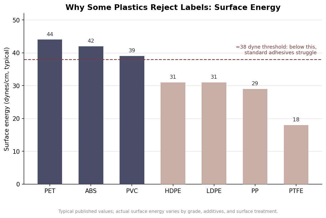
    Three variables decide whether a label holds. The first is surface energy, a measure of how readily a surface lets an adhesive wet out and grip it. High-energy surfaces such as glass and metal are easy to bond. Many common container plastics are the opposite: polypropylene sits around 29 dynes per centimeter and the polyethylenes around 31, well below the roughly 38-dyne mark where standard adhesives start to hold confidently. That is why a label that clings happily to a glass jar slides off an HDPE bottle of the same product. The values below are typical rather than exact, since grade, additives, and any surface treatment shift them, but the pattern is consistent.

    Bar chart of surface energy in dynes per centimeter for common plastics with a 38-dyne adhesion threshold line; HDPE, LDPE, PP and PTFE fall below it
    Surface energy of common plastics; those below about 38 dynes need a high-tack or rubber-based adhesive.

    The second variable is temperature, both when the label is applied and where the product lives afterward. Pressure-sensitive adhesives need enough warmth to flow and wet the surface at the moment of application; apply below an adhesive’s minimum application temperature and it never fully grabs, even if the freezer it later enters is rated fine. The third variable is time. Pressure-sensitive bonds are not final on contact. Initial tack happens immediately, but the bond keeps building for roughly 24 to 72 hours as the adhesive flows into the surface, which is why a label that looks stuck at the filling line can still be repositioned an hour later and only reaches full strength a day or two on.

    The everyday adhesives

    Permanent acrylic is the default for good reason. It applies in a normal room, roughly 40 to 100 degrees Fahrenheit, serves from about 35 to 200 degrees, and it is UV-stable, ages well, and resists chemicals. On glass, metal, and smooth higher-energy plastics it is the sensible all-rounder for retail products that live indoors or in ambient conditions. Most bottle, jar, and box labels start here and only move off it for a specific reason.

    Removable acrylic is built to come away cleanly, which makes it right for price tags, promotional overlays, returnable containers, and anything a customer or warehouse will peel. The catch that surprises people is that removable adhesives bond more strongly the longer they sit and the warmer they get, so a label meant to lift off after a week may fight you after a month in a hot store. When clean removal matters, test it at the age and temperature it will actually face. High-tack acrylic or rubber-based adhesive is the answer to the surface-energy problem above: it is formulated to grab low-energy plastics like polyethylene and polypropylene, textured and recycled substrates, and rough surfaces where a standard adhesive simply slides. Rubber-based permanents push this further with very high initial tack for the most stubborn plastics and for cold, wet, or slightly oily surfaces, at the cost of less UV stability, since they can yellow over time.

    Cold, hot, wet, and oily: the specialty adhesives

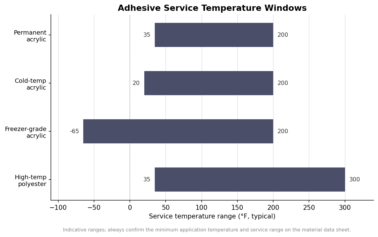
    When the environment leaves the ordinary range, the adhesive has to change with it. Cold-temperature acrylic applies down to around 25 to 35 degrees and serves from about 20 degrees upward, which suits refrigerated containers, chilled-beverage displays, and surfaces prone to condensation. It is built for refrigeration, not freezing. For true frozen goods you need a freezer-grade adhesive that can be applied at or near zero degrees Fahrenheit and stays flexible and tacky in service down toward minus 65, without going brittle and shedding the label. Cold-chain pharmaceuticals and frozen food both depend on it, and the temperature windows below show how much wider that span is than a standard permanent.

    Horizontal range chart of service temperature windows for permanent, cold-temp, freezer-grade, and high-temperature label adhesives
    Typical service temperature windows by adhesive type; freezer-grade spans far colder than a standard permanent.

    Heat is the mirror image. High-temperature adhesives serve continuously to around 300 degrees and tolerate brief peaks higher still, but they only make sense paired with a polyester face stock, since paper and BOPP will scorch or distort long before the adhesive gives out. These belong on oven-bound cookware, machinery near heat, engine-bay parts, and items that will be sterilized. Wet and oily surfaces deserve their own caution: even the right chemistry cannot bond through a film of moisture or lubricant, so surface preparation matters as much as adhesive choice when a container is damp or greasy at the point of labeling.

    How to specify so the bond holds

    Getting this right on an order comes down to describing the real conditions, not just the look. Tell your label supplier the exact container material, because “plastic bottle” could mean easy PET or difficult HDPE and the adhesive recommendation flips between them. State the temperature at which the label will be applied and the temperature range the product will live in, including any trip through a cooler or freezer. Note whether the surface is smooth or textured, curved or flat, and whether it may be wet or oily when labeled. Say whether the label must ever come off cleanly, since that single requirement rules permanent adhesives out.

    Then give the bond time and a clean surface. Apply to a dry, dust-free container within the adhesive’s application-temperature window, and where you can, let the label cure for about 24 hours before the product meets its harshest conditions, especially before it enters a freezer. When the stakes are high, order a small quantity first and test it on the actual container in the actual environment for a few days rather than trusting a data sheet alone. The published application and service temperatures are a reliable starting point, but they are typical figures, so the material data sheet for the specific adhesive, and a short real-world test, are what turn a good guess into a label that stays exactly where you put it.

  • How to Spec Custom Candle Labels: Warnings, Net Weight, and Materials

    How to Spec Custom Candle Labels: Warnings, Net Weight, and Materials

    A candle label has two jobs, and most first orders only do one of them. It has to sell the candle on a crowded shelf, and it has to carry the safety and content information that federal rules and retailers expect. Get the first part right and skip the second, and you can end up reprinting a run, getting pulled from a marketplace, or peeling warped labels off warm jars. Here is how to write a candle label spec that covers both, in the order you actually make the decisions.

    Start With the Warning Block, Because It Is Not Optional in Practice

    The candle fire-safety warning comes from ASTM F2058, the consensus standard for candle fire-safety labeling. It is technically a voluntary standard, but in practice it functions as a requirement: major retailers and online marketplaces expect it, and skipping it is the fastest way to get a listing rejected or a wholesale account declined. The block has a fixed anatomy. The signal word WARNING appears in bold at the top, followed by three safety statements that can be shown as text or as approved pictograms: burn the candle within sight, keep it away from anything that catches fire, and keep it away from children. Placement is flexible, which is why most makers put the full block on the base of the vessel and keep the front label clean.

    Design the warning block as its own artwork element early, not as an afterthought squeezed in at proof stage. If you plan to use the pictogram versions to save space, confirm your printer has the approved symbol set, because a reddrawn or stylized icon is not the same as the standardized one.

    Get the Net Weight and Identity Right

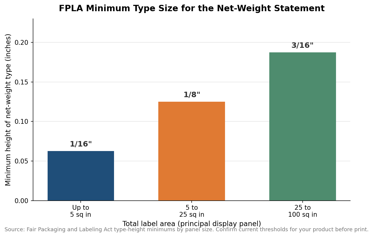
    The Fair Packaging and Labeling Act governs the rest of the required content, and it is federal law rather than a voluntary standard. You need a statement of identity, meaning a plain product name such as “scented candle” or “soy candle,” and you need the net weight of the finished candle, wax and wick included, shown in both US customary and metric units. The net weight has to sit in the bottom thirty percent of the principal display panel, and it has a minimum type size that scales with the label.

    Bar chart of FPLA minimum net-weight type height: 1/16 inch, 1/8 inch, and 3/16 inch by label area
    The required net-weight type size grows with the label, and designers often set it too small.

    On a small label up to five square inches, the net-weight type has to be at least one-sixteenth of an inch tall; between five and twenty-five square inches it climbs to one-eighth of an inch; and from twenty-five to one hundred square inches it reaches three-sixteenths of an inch. Designers routinely set this text too small to look tidy, then have to redo the layout. Set it at the minimum from the start and build the composition around it. You also need the name and location of the manufacturer or distributor; a town and state will do if a phone number or website is present, and if you outsource production you use “manufactured for” or “distributed by” language.

    Choose a Material That Survives Wax, Oil, and Heat

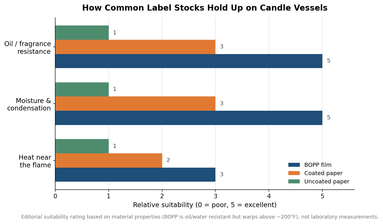
    Candle vessels are a hostile environment for a label. Fragrance oils get on the glass during pouring and handling, finished candles sweat in warm rooms, and the upper vessel gets genuinely hot while burning. That rules out bare uncoated paper for most applications, because it wrinkles, smudges, and lifts when it meets oil or condensation. The workhorse choice is BOPP film, a biaxially oriented polypropylene that shrugs off water and oil, resists wrinkling when wet, and bonds well to curved glass with the right adhesive.

    Grouped bar chart rating BOPP film, coated paper, and uncoated paper for oil, moisture, and heat resistance on candle vessels
    BOPP film leads on oil and moisture; keep any stock away from the hottest part of the jar.

    BOPP has one real limit worth designing around: it starts to warp above roughly two hundred degrees Fahrenheit, so on a vessel that runs hot near the flame you want the label low on the jar rather than up near the rim. Coated paper sits in the middle; it gives you the premium matte look many candle brands want and holds up far better than uncoated stock, but it still trails film on oil and moisture resistance. If the brand look demands paper, specify a coated or laminated paper and keep it away from the hottest zone. Whatever the face stock, ask for an adhesive rated for curved glass, and if any of your candles ship or store cold, confirm the adhesive is rated for low temperatures so labels do not lift in transit.

    Size and Place the Label for a Round Vessel

    Curved surfaces punish oversized labels. A label that wraps too far around a jar will pucker at the trailing edge, and one that is too tall relative to the straight section of the vessel will bridge over the curve and tunnel. As a working rule, keep the label height inside the truly straight portion of the glass and leave the wrap short of a full circumference unless you are intentionally doing a full wrap with a seam. For a standard straight-sided tumbler, a front label plus a separate base label for the warning block is the most forgiving layout. Order a small proof quantity and apply it to the actual production vessel before committing to a full run, because a design that looks right flat can misbehave on glass.

    Turn It Into a Spec Sheet

    Pulling it together, a sound candle label order specifies the face material and finish, the adhesive and its temperature rating, the die-cut size matched to the vessel’s straight section, and a proof of the warning block and net-weight statement at their real printed sizes. As an indicative planning figure, custom die-cut candle labels on film commonly run somewhere in the range of roughly ten to forty cents per label depending on size, quantity, and finish, with minimum orders often starting around two hundred fifty to five hundred pieces and production lead times frequently near one to two weeks after proof approval; treat those as starting points to confirm with your supplier rather than fixed quotes. Nail the compliance content once, save it as a reusable artwork layer, and every future scent variation becomes a quick swap of the front panel rather than a fresh compliance review.

  • How to Choose Custom Labels for Your Brand

    How to Choose Custom Labels for Your Brand

    How to Choose Custom Labels for Your Brand: Use Cases and Ordering

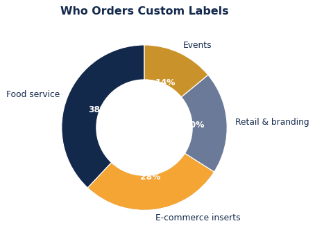
    The best way to choose custom product labels is to start from how they will be used, then work back to the material, size, and decoration that fit. Custom product labels serve very different jobs across food service, e-commerce inserts, retail & branding, and events, and matching the order to the job is what makes custom labels feel purpose-built rather than generic. This guide maps the common use cases and walks through ordering custom labels that fit your brand.

    Whether the product labels protects a product, presents a gift, or carries a logo into the world, defining that job first keeps every later decision easy. Purpose drives the spec, and the spec drives the result.

    How brands use custom labels

    Custom product labels get ordered for a mix of protection, presentation, and promotion, and knowing where yours fall points you to the right build. The breakdown below shows the common uses, from food service to events.

    The common ways brands put custom labels to work.
    The common ways brands put custom labels to work.

    Most orders lean toward one primary job with a secondary benefit — a shipping-focused product labels that also brands the unboxing, or a gift-focused one that also protects. Naming your primary use keeps the order focused and the spec appropriate.

    Use case What it needs
    Food service branded, food-safe paper that dresses up a serve
    E-commerce inserts thank-you and instruction cards that build loyalty
    Retail & branding labels and wraps that reinforce the brand
    Events printed pieces that tie a theme together

    Matching material and size to the use

    Once the use is clear, the material and size follow. A protection-first job favors a durable, well-fitted build; a presentation-first job favors a premium material and a clean print; a promotion-first job favors a cost-effective option you can order in volume. Sizing to the product with a small margin keeps the product labels looking intentional and performing its job.

    If a single order serves more than one use, spec to the most demanding one so the product labels performs everywhere. It is easier to use a slightly sturdier or more premium product labels across the board than to discover a bargain option falls short for your most important use case.

    Branding for the impression you want

    Decoration should reinforce the impression the use calls for. Digital and offset printing reproduce full-color art crisply, with spot colors and foil available for a premium touch. For a premium or gift use, lean on finishes and restraint; for high-volume promotion, prioritize a bold, legible logo that reads at a glance and reproduces affordably at scale. Keep branding consistent with the rest of your packaging or merch so everything reads as one system.

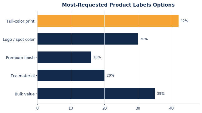
    The most-requested options below reflect what buyers reach for most, and they are a useful starting menu when you brief your order. Whatever you choose, approve a proof so the finished custom labels match the impression you intended.

    The options buyers request most on custom product labels.
    The options buyers request most on custom product labels.

    Getting the size and details right

    Even with the use and material decided, the details are what make custom labels feel finished. Confirm the size and weight against the product with a small margin, check the print area for your chosen size so the logo sits cleanly, and decide on any finishing touches before you brief the order. These small confirmations up front are what separate a product labels that looks intentional from one that looks close-enough.

    A sample or proof is the cheapest insurance you can buy on a product labels order. A physical sample lets you judge the material and print in hand, while a digital proof confirms artwork, color, and size and weight before the full run. Spending a few minutes here prevents the far larger cost of reworking a finished order of custom labels that missed on a detail.

    Ordering: quantities, lead time, and reorders

    A smooth product labels order comes down to a few basics: order for real demand plus a small overage, send print-ready artwork early, and confirm lead time against any deadline so production and shipping fit your timeline. Per-unit cost drops with volume, so consolidating a season’s needs into one run is usually more efficient than repeated small orders.

    Keep your approved artwork and spec on file so reorders are a quick repeat rather than a fresh setup each time — consistency across runs keeps your brand looking deliberate.

    Coordinating with the rest of your brand

    Custom product labels rarely stand alone; they sit alongside your other packaging, print, or merch, so coordinating them strengthens the whole brand. Carrying the same logo, colors, and tone across your product labels and your other pieces makes everything read as one deliberate system rather than a set of one-off orders. That consistency is what makes a brand feel established, and it costs nothing extra to plan.

    Coordination also simplifies buying over time. Standardizing on a material, size, and decoration you are happy with turns future orders into simple repeats, and it keeps every batch matching the last. A little upfront alignment pays back every time you reorder custom labels.

    Frequently asked questions about custom labels

    What are custom labels used for?

    Custom product labels serve a mix of protection, presentation, and promotion across food service, e-commerce inserts, retail & branding, and events. Most orders lean toward one primary job with a secondary benefit, so naming your main use is the first step in speccing the right product labels.

    How do I match custom labels to my use?

    Let the use drive the spec: durable and well-fitted for protection, premium and clean for presentation, cost-effective and bold for promotion. If one order serves several uses, spec to the most demanding one so the product labels performs everywhere.

    How should I brand custom labels?

    Digital and offset printing reproduce full-color art crisply, with spot colors and foil available for a premium touch. Choose finishes and restraint for premium or gift uses, and a bold, legible logo for high-volume promotion, keeping the branding consistent with your other packaging or merch so it all reads as one system.

    How far ahead should I order custom labels?

    Order for real demand plus a small overage, send print-ready artwork early, and confirm lead time against any deadline so production and shipping fit your timeline. Consolidating a season’s needs into one run is usually more efficient than repeated small orders.

    Can I reorder easily?

    Yes. Keeping your approved artwork and spec on file makes reorders a quick repeat rather than a fresh setup, and it keeps every batch of custom labels matching the last for a consistent brand look.

    Do I need a sample before ordering custom labels?

    A sample is worth it for a first order or a new material, since judging feel and print in hand removes the guesswork. For a straightforward reorder of custom labels you have bought before, a digital proof confirming artwork and size and weight is usually enough.

    Match the product labels to the job, spec it deliberately, and approve a proof, and your order will do exactly what you needed. For the full material and sizing breakdown, see our companion guide, our Custom Labels: Materials, Sizing & Branding Guide, and browse our our shop to get started.

    Not sure which custom labels fit your use?

    Tell us how you’ll use them and we’ll match the material, size, and branding to the job.

    Get a Quote

  • Custom Labels: Materials, Sizing & Branding Guide

    Custom Labels: Materials, Sizing & Branding Guide

    Custom Labels: A Materials, Sizing, and Branding Guide

    Getting custom labels right comes down to three decisions: the material, the size or spec, and how you brand them. Make those well and you end up with custom labels that protect and present your product, reinforce your brand, and land on budget. This guide walks through the material options, how to size and spec your order, and how to decorate custom labels so they do real work for your brand rather than just checking a box.

    Whether you are ordering your first run or reordering at scale, the same fundamentals apply. Choosing custom labels deliberately — material to job, size to product, decoration to brand — is what separates an order you are proud of from one you settle for.

    Why custom labels matter for your brand

    Custom labels are more than a commodity; they are a touchpoint brands experience directly. A well-chosen, well-branded option signals quality and attention to detail, while a generic one quietly undercuts an otherwise strong product. Because custom labels are seen and handled, they carry your brand into the world every time they are used.

    That visibility is exactly why it pays to spec custom labels intentionally. The material sets the feel, the size sets the fit and cost, and the decoration sets the impression — and getting all three aligned turns a functional item into a genuine brand asset.

    Materials and options compared

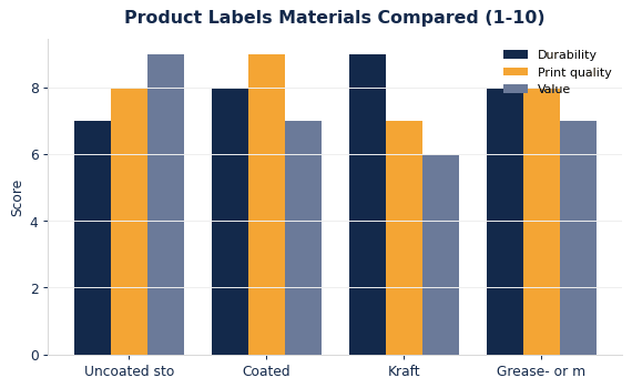
    The common materials for custom labels each trade off durability, print quality, and cost: uncoated stock, coated / gloss stock, kraft / recycled, and grease- or moisture-resistant. The right pick depends on how the product labels will be used, the look you want, and your budget. The chart and table below compare the main options so you can match material to job.

    How common product labels materials compare on durability, print quality, and value.
    How common product labels materials compare on durability, print quality, and value.

    As a rule of thumb, choose a recyclable or natural material when eco positioning matters, a coated or laminated option when you want vivid full-color print, and a premium build when the product labels is part of a gift or high-end presentation. When in doubt, request a sample so you can judge feel and print before committing to a full run.

    Material / option Best for
    Uncoated stock natural, writable surface with a matte look
    Coated / gloss stock vivid color and a polished finish
    Kraft / recycled eco-forward, warm natural tone
    Grease- or moisture-resistant food-safe performance where needed

    Sizing and specs

    Sizing is where many product labels orders go wrong, so measure before you order. Custom labels typically range from a small insert card up to a full wrap or liner sheet, and the right size and weight depends on the product or use they serve. Too small and the fit is tight or the product is exposed; too large and you pay for material you do not need and lose a clean, intentional look.

    When a measurement falls between standard options, size to the product with a small margin rather than guessing. Confirming the size and weight on a proof or sample before a large run prevents the costly mistake of a full order that does not fit, which is far more expensive to fix than a five-minute check up front.

    Branding and decoration

    Decoration is what turns a plain product labels into a branded one. Digital and offset printing reproduce full-color art crisply, with spot colors and foil available for a premium touch. Match the method to your artwork and budget: simple logos reproduce cleanly and cheaply, while detailed, full-color designs shine with the right process on the right material. Keep the artwork vector where possible and confirm the print area for your chosen size.

    Restraint usually reads as premium. A clean logo, one or two brand colors, and quality material almost always look more considered than a busy, over-printed design. Approving a proof before the run protects both the look and the budget, especially on a large order of custom labels.

    Ordering and budget

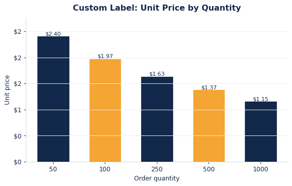
    Per-unit cost on custom labels falls steadily with volume as setup amortizes across more pieces, so ordering for real demand rather than a token first batch is usually the efficient move. The curve below shows how pricing typically improves with quantity, which helps you plan an order that balances cash and cost.

    Typical per-unit product labels pricing as order quantity increases.
    Typical per-unit product labels pricing as order quantity increases.
    Ordering for a recurring need? A single larger run lowers the unit cost and keeps your branding consistent, while a small overage covers reorders and the occasional damaged piece without a rush order.

    Common mistakes to avoid

    A few avoidable missteps account for most disappointing product labels orders. Ordering before measuring is the biggest, followed by choosing a material for price alone without considering how the product labels will actually be used, and skipping the proof on a large run. Each is easy to prevent with a few minutes of planning, and each is expensive to fix once a full order is produced.

    The other common trap is over-designing the artwork. Cramming in too many colors, effects, or details can muddy the print and raise the cost, especially on textured or recycled materials. Simplifying the design to a clean, legible mark almost always improves both the look and the price of your custom labels.

    Frequently asked questions about custom labels

    What material is best for custom labels?

    It depends on the use: choose a recyclable or natural material for eco positioning, a coated or laminated option for vivid full-color print, and a premium build for gifting or high-end presentation. Request a sample to judge feel and print before a full run of custom labels.

    How do I choose the right size?

    Measure the product or use the product labels serves, then size to it with a small margin so the fit is clean without wasting material. When a measurement falls between standard options, size up slightly and confirm the size and weight on a proof before ordering in volume.

    How are custom labels branded?

    Digital and offset printing reproduce full-color art crisply, with spot colors and foil available for a premium touch. Match the method to your artwork and budget, keep the art vector where possible, confirm the print area for your size, and approve a proof so the finished custom labels match your intent.

    How does pricing work, and is there a minimum?

    Per-unit cost drops with quantity as setup amortizes across the run, so larger orders are more cost-effective. Order for real demand plus a small overage rather than a token batch, and consolidate recurring needs into one run for the best price.

    Can I get a sample or proof before ordering?

    Yes, and it is strongly recommended. A physical sample lets you judge material and print, and a digital or physical proof confirms your artwork, color, and size and weight before a full run — a small step that prevents a costly mistake on a large order.

    What do you need to quote custom labels?

    To quote accurately we need the size and weight or the product they serve, the quantity, your material preference, and your artwork or a description of the branding. With those details we can recommend the right material and size and give you pricing for the run, and a proof follows once the order is confirmed.

    Whatever you order, send vector artwork, confirm material and size and weight, and approve a proof before production. For help matching custom labels to a specific use, see our companion guide, our How to Choose Custom Labels for Your Brand, and explore our our shop to start your order.

    Ready to order custom labels?

    Tell us your product, quantity, and branding and we’ll match the material, size, and decoration for you.

    Get a Quote